Norway’s 2026 traffic light decision assigned classifications across all 13 production areas. Three received green lights allowing up to 6% biomass growth, nine remained at yellow, and PO3 received a red light and a 6% production capacity reduction for the third time.
The Institute of Marine Research has since proposed replacing the 13 production areas with 28 smaller zones to connect regulation more closely to site-level lice exposure risk. We covered both developments in the latest episode of Fish n’ Bits.
No matter where a farm sits, the analysis still lands on the same teams. Before anyone can review lice pressure, treatment timing, welfare, or production performance, the data first needs to be brought together.
Watershed Reporting removes that setup work by connecting your fish health, treatment, environmental, production, and mortality records in one system. The example below uses sea lice and treatment data to show how quickly your team can build an analysis and adjust it as the questions change.
Build a New Analysis in Minutes
This is where the flexibility of Watershed Reporting becomes clearest. You can take the same connected data and view it in several ways without rebuilding the report from scratch.
View Every Cage on One Timeline
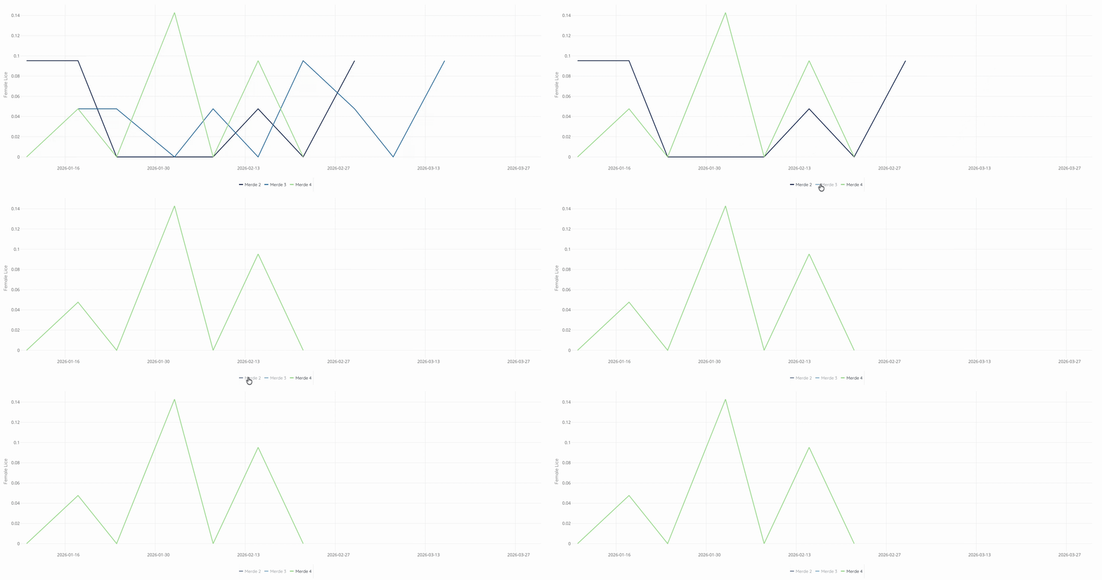
Load the full site and each cage appears as its own line on the same timeline. You can toggle individual cages on or off depending on what your team needs to compare.
This gives operations and fish health teams a quick way to see whether one cage is beginning to behave differently from the rest of the site, without moving between separate reports.
Isolate a Single Cage
When one cage needs a closer look, you can isolate it without rebuilding anything. The metrics and timeline stay the same while the rest of the site drops out of view.
This lets your team move from a broader site review into a focused investigation in a few seconds.
Compare Generations Side by Side
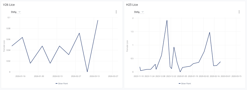
Use Add Visual to bring the same metrics into the report for a previous generation at the same site. The current and prior generations then sit side by side using the same report structure.
Seasonal pressure, temperature changes, treatment timing, and how quickly lice levels developed during the previous cycle become easier to compare when both generations are visible together.
These are not three separate reports. They are three ways of looking at the same connected data.
Setting KPIs & Goals Across Metrics
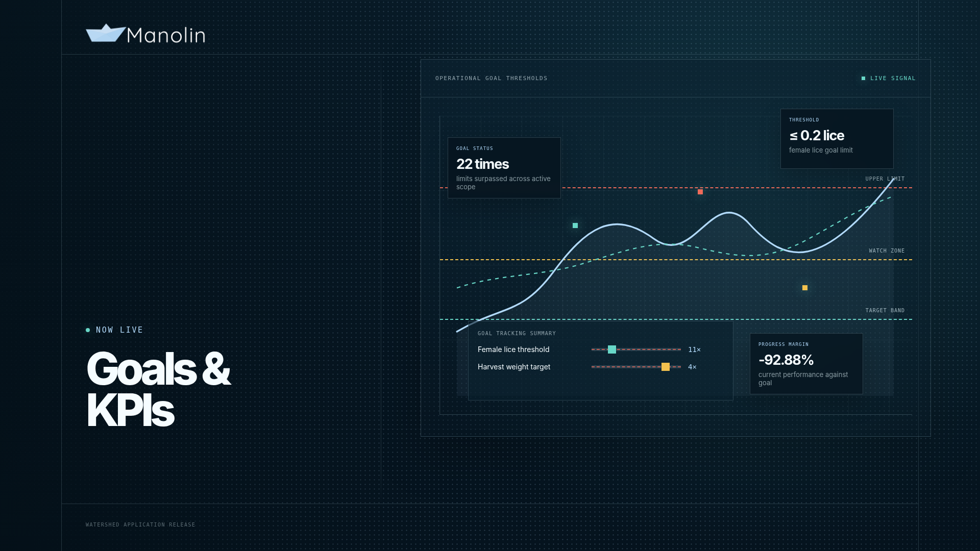
We know that simply seeing a metric is not always enough. Your team also needs to understand how it is tracking against the target that matters. You can add a goal to any metric in a Watershed report by selecting the condition and entering the target value. Once saved, the goal appears directly on the chart as a dashed reference line.
Below the visual, Watershed shows how many times the threshold was surpassed and where the current value sits in relation to the goal. If you switch the report from daily to weekly, both figures recalculate automatically.
In a lice analysis, a goal might reflect the relevant regulatory limit or a more conservative internal threshold. The same function can be used for feed conversion, mortality, harvest weight, welfare scores, or any other metric in the report.
This way, the target stays connected to the analysis your team is already reviewing.
Forecast Any Metric In Your Analysis
For a generation currently in production, you can project any metric forward from its current trend. Choose how many days you want to model and which metrics to include, and Watershed adds the projected lines directly to the chart.
This helps your team look beyond the most recent observation. Where is the trend heading? When could it reach a threshold if the pattern continues? Is one cage beginning to move differently from the rest of the site? The forecast uses the historical trend in your connected records, so your team can explore what may happen next without building a separate model.
Rearrange as Often as Things Adjust
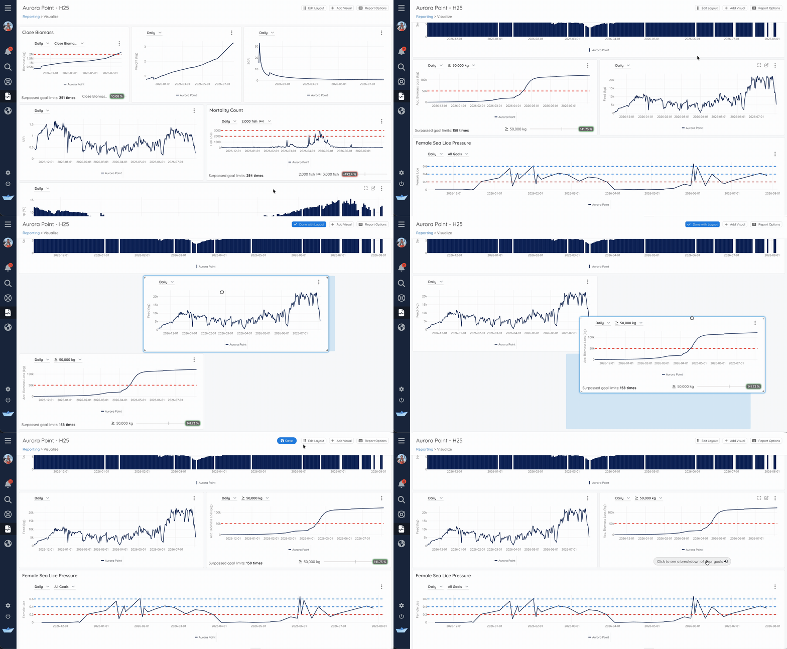
Once the report is built, you can arrange it around how your team reads the data. Drag and resize each visual, save the layout, and the same configuration will be there for the next review.
A routine weekly review may need one structure, while a change in lice pressure or a recent treatment event may shift which metrics deserve the most attention. Edit Layout lets you make those changes without rebuilding the report. This way, the reporting adapts to how your team works instead of forcing every review into the same format.
What Comes After the Analysis
Sea lice and treatment planning are only one example of what you can build with Watershed Reporting. The same workflow applies to welfare reviews, production KPI tracking, generation summaries, treatment follow-up, and comparisons across sites.
Reporting can also be the starting point for the next decision. When the analysis points toward treatment, the Treatment Recommender uses the historical records behind the report to model where and what to treat next. When planning moves toward harvest, the Harvest Planner helps evaluate timing against the production goals for the generation.
Each tool works from the same connected records already available in your Watershed account. With records across systems already integrated together, your team can start the analysis in minutes, adjust the report as the situation changes, and share it the same day.
Book a demo now to see how Manolin can improve your data reporting.